In the coming weeks we will be releasing updates to the System Management page and Dashboard.
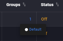
The System Management page has undergone a fairly significant change. The page now has a table layout with sortable columns. Instead of subway map lines, users can see related groups and policies through a tooltip rendered on hover. Actions such as Run Policy, Assign Group/Policy, Remove Group/Policy and Manage Approvals (for manual policies) can now be executed directly from the Group/Policy table instead of having to access the edit page of an individual policy or group.
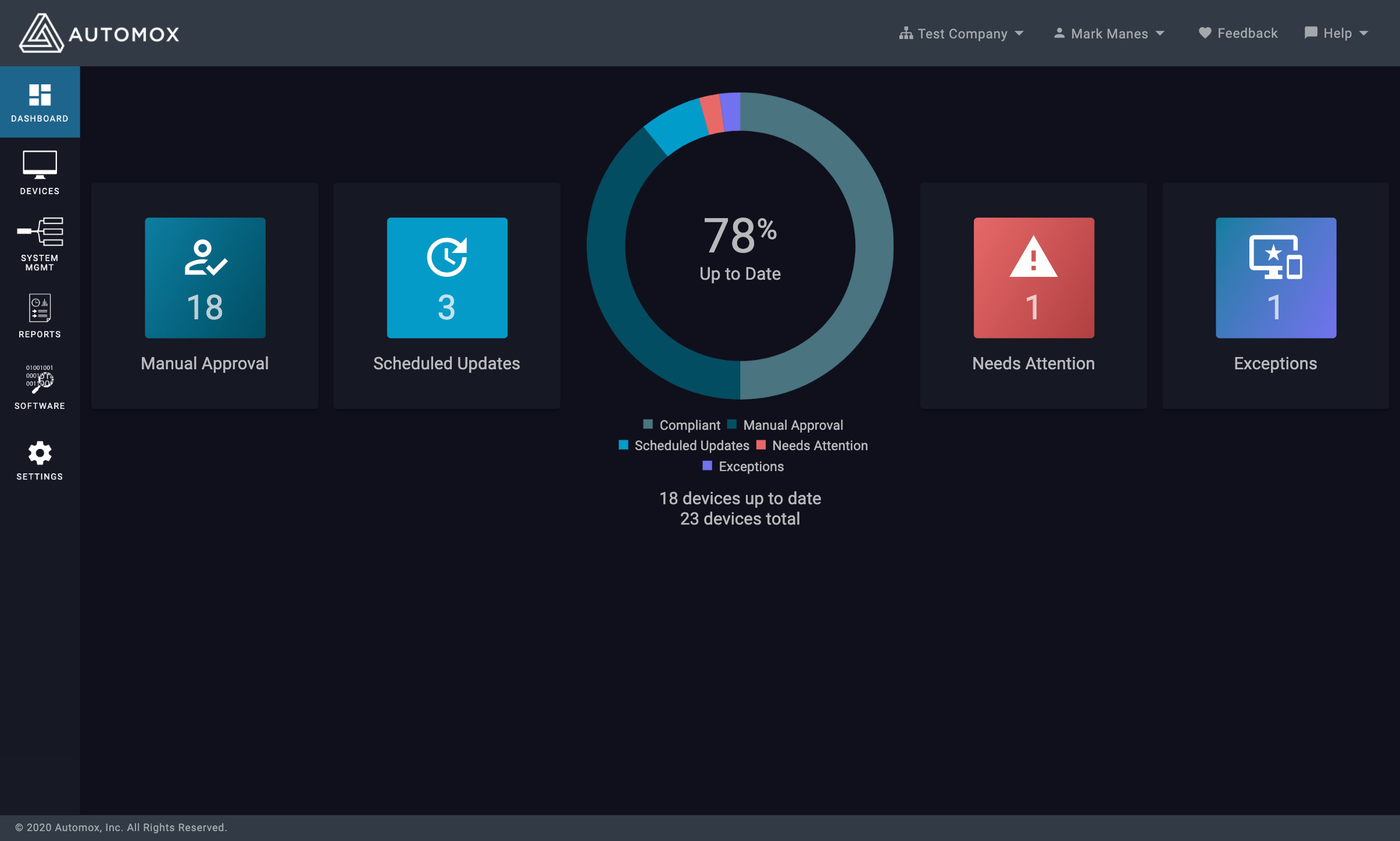
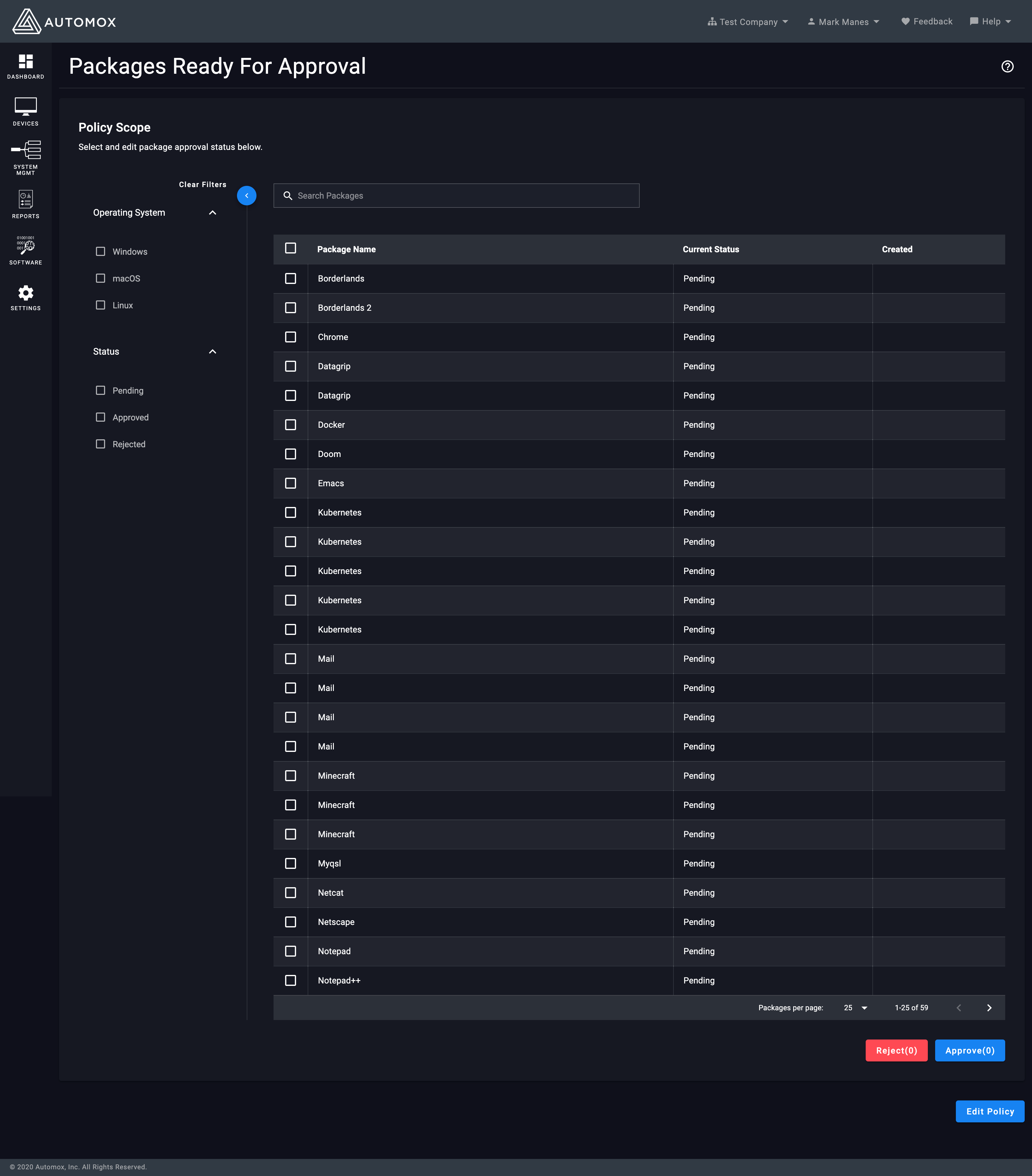
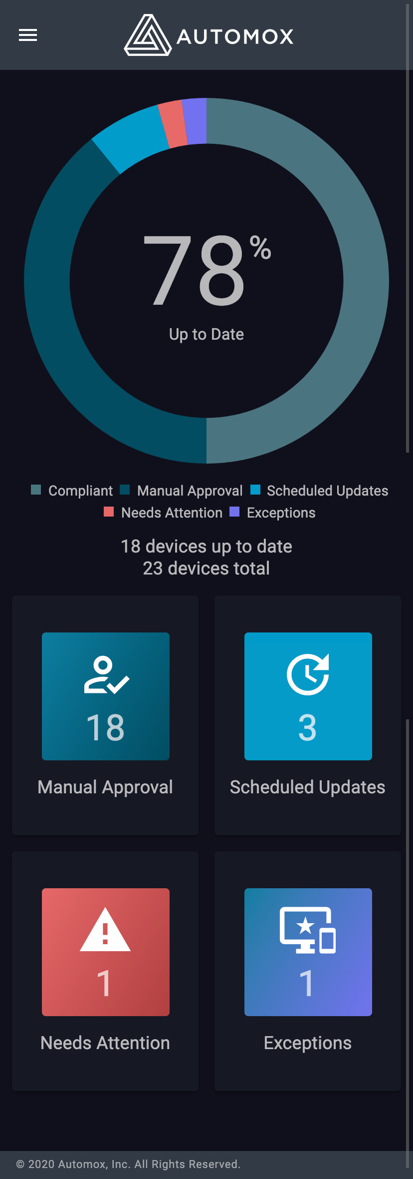
There are no significant changes to the Dashboard functionality or design. There will be minor updates to the icons to better align with new styles. Additionally, the Manual Approval button on the Dashboard will no longer render a list of patches on that page, but rather take the user to the new Manual Approvals page we are creating with the policy work. This page will allow for sorting, searching and filtering - which is a significant improvement over the list that renders on the Dashboard today.,


