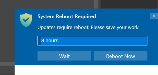
Is it possible to change this UX? We are starting to roll out, and our users and reporting that this popup looks fake (like a spammy “Windows update centre” popup). Potentially if we could replace the green shield with our logo, or just remove it completely that would be better.

