Today we released a new Device Details page as part of our overall Vue migration. The updated design of the Device Details page has been updated with a few enhancements. Auto save for editable Device attributes has been changed to an explicit action. We are now exposing the status for the Device, Connection and Policy. The icons for each status has had a minor refresh. The policy and software tables remain sortable with the same actions exposed.


As always, we would love to hear your feedback - so feel free to reply to this thread with your thoughts.

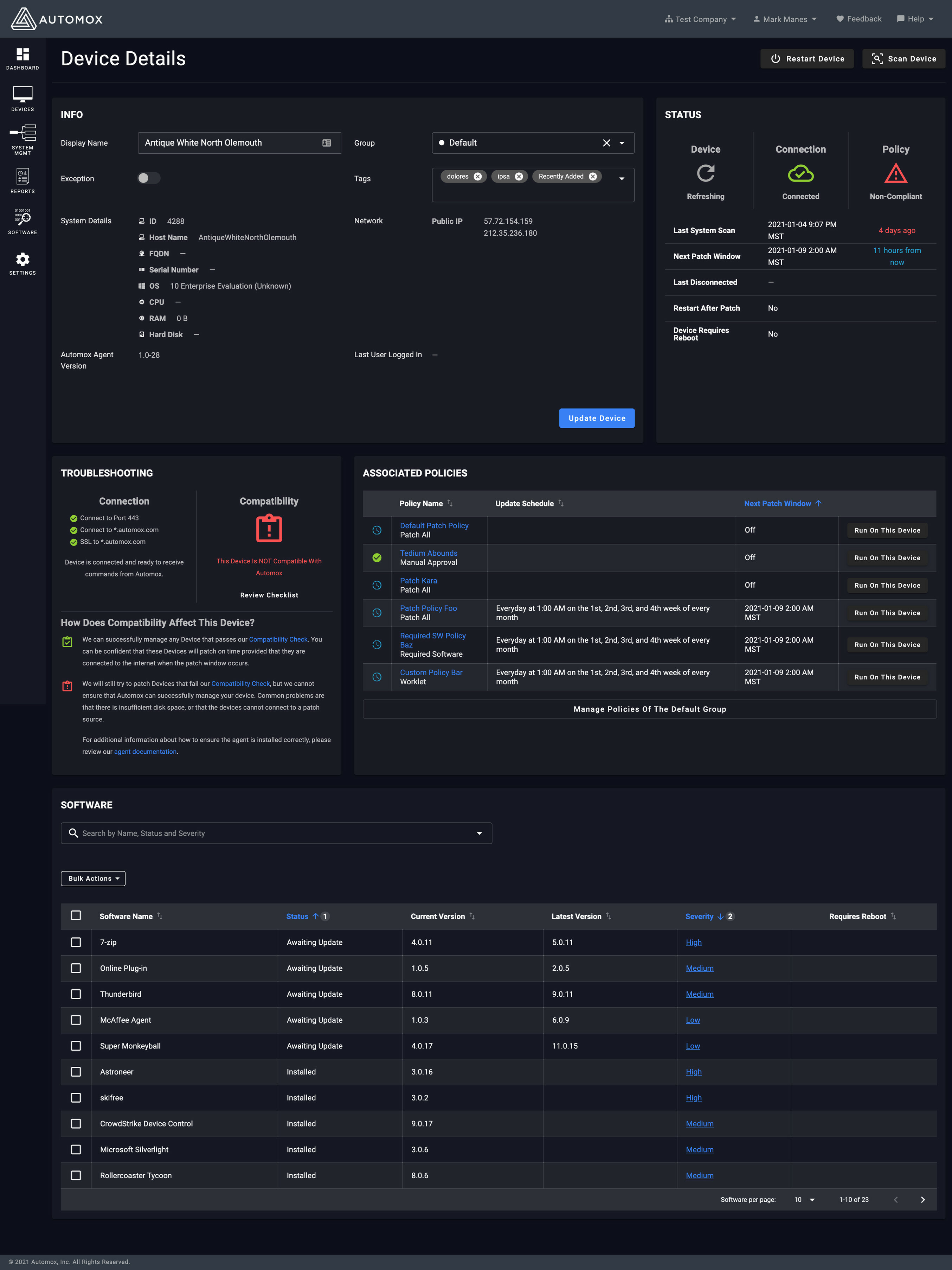

Info:


Would it be possible to show uptime and last reboot date & time?


Software:


On the Status and severity you have numbers, in the image above, what do they represent?


The rest I like.


Thank you for your feedback


For uptime, do you mean the percentage we detect connection status? Over what time period?


On software, this screenshot is from a test environment - I did not catch the dummy data in those columns - apologies for that.


Lark


For me, uptime, how long has the endpoint been available/accessible, think like how long has it been since last reboot


  • not for how long it has been connected to Automox.


The numbers are still present, for me at least 🙂


Hello @it_stuck! The number represent column sort priority. If you toggle ascending, descending, off you’ll notice the number go away. 1 is the initial sort, 2 is the secondary sort (so the software is sorted first by severity and then status within a severity in your screenshot)


I like the new look and function. One thing I noticed - If I drill into a device detail from the devices page and then use the Browser back arrow or mouse back button, the Devices page doesn’t load. Just the load Icon sits and spins. If I select the refresh page, then the Devices page will load. I’m using up to date Chrome Browser.


apologies - Jarod is correct, I misunderstood your comment. We are going to have our UX folks take a look to see if we can make this less confusing.


thanks again for your feedback


thanks for your feedback - this is a known issue - we have a bug that the engineers are looking into this week.


I think fixing the spinning icon has to be the priority, but if changes had to be made, I would have considered making the ‘Scan Device’ and ‘Restart Device’ buttons further apart. This might be due to using Automox on a laptop more often than previously, but I would also put the Software section above the INFO section - the INFO section is useful to have, but is seldom the reason I click on Device Details.


Example: when you scroll down in Device Details you come to a blue button titled ‘Update device’ - that’s what I want to do - update the device. That reads to me like outstanding patches will get applied.


‘Update Info’ would be more accurate.


Thanks for that feedback. I’ve passed it along to the product team.


Enjoying the new update! Much better than before.


thanks for the compliment! Would you be willing to share what you like about the update - we’d appreciate the input!


In general everything looks a lot easier on the eye and much clearer, especially the system details section and status section. Some GUI elements could do with being consistent such as ‘ram’ and ‘hard disk’ results being below their respective titles like the other system details. The ‘update device’ button seems to be active even though no changes have been made to the device, it would make more sense for it to be active unless a change has been made, then it could be greyed out. Last logged in user could have a section for last logged in date instead of it just being under that one section.