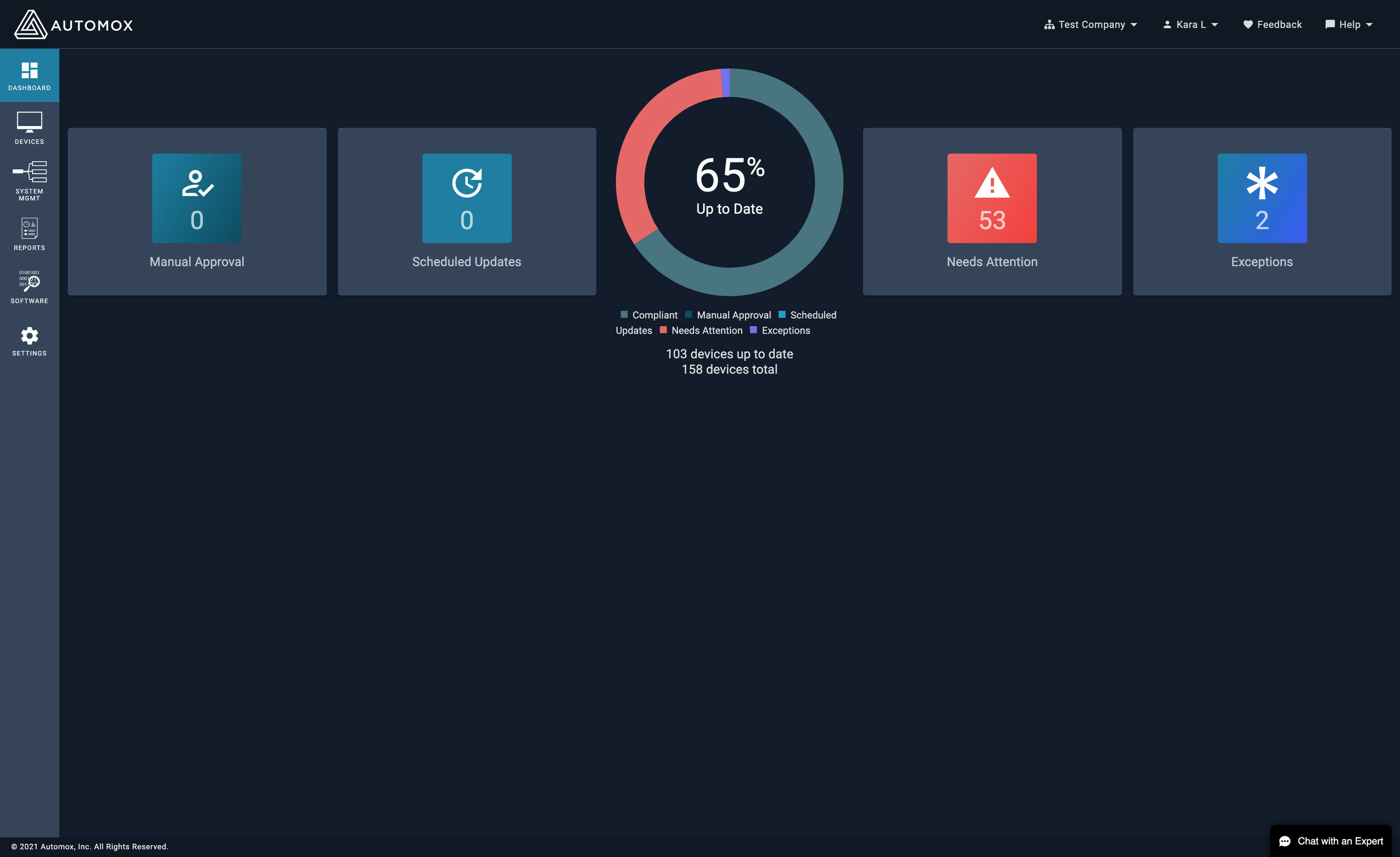
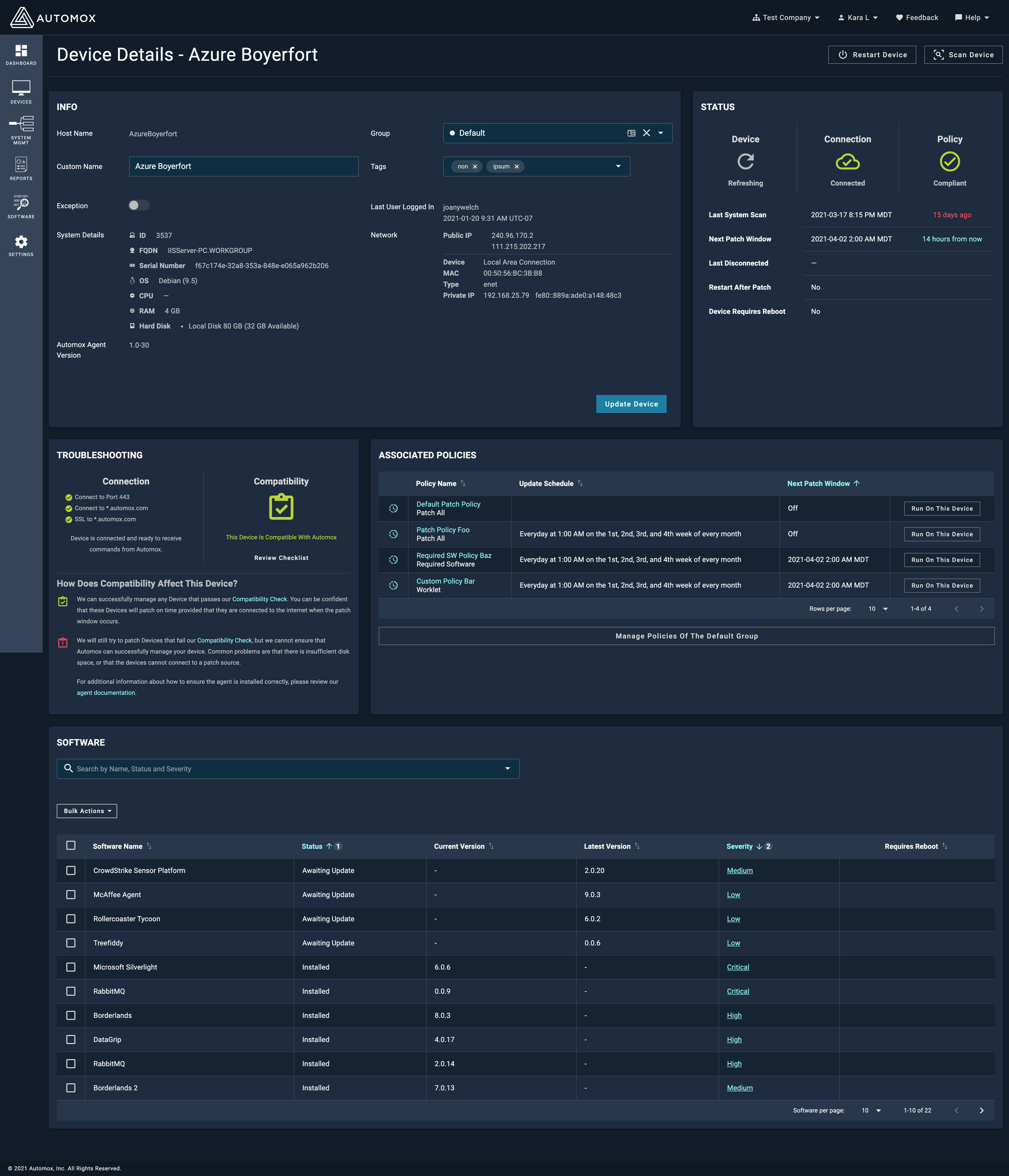
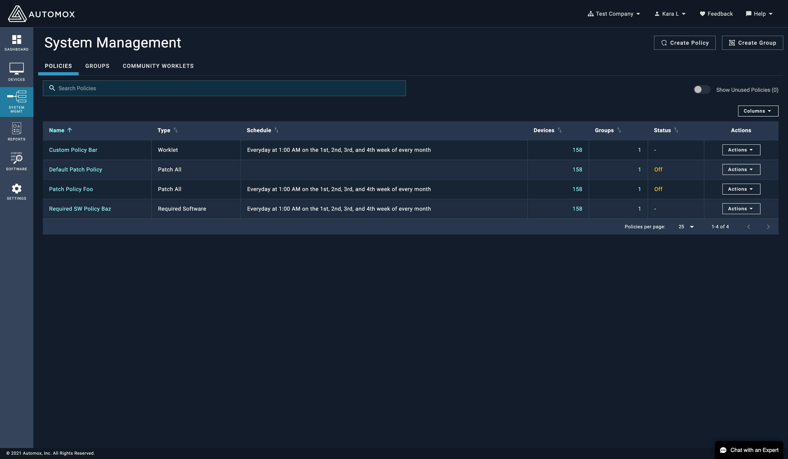
Later this week we will be releasing an update to the console to refresh the colors to better align with our new Design System. We are excited to release this foundational work over the coming months which will help us build a more consistent and user friendly experience for console users.


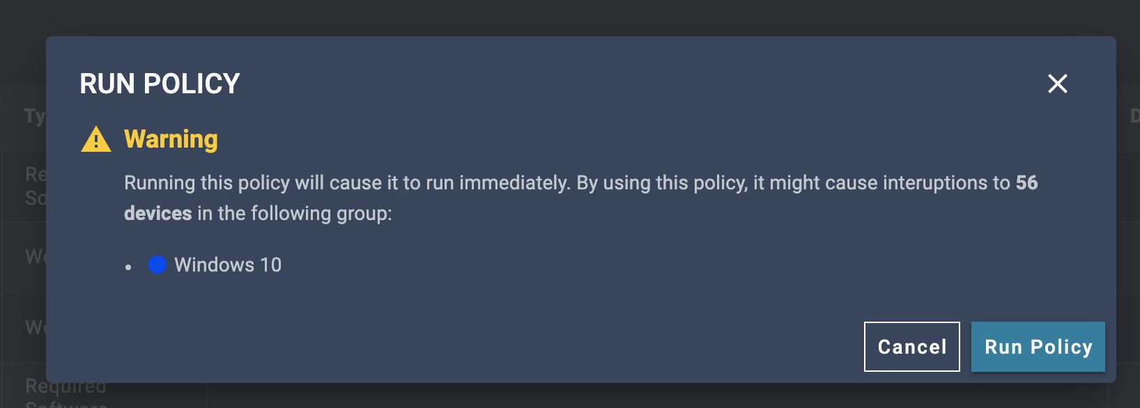
A few screenshots below:


We welcome your feedback once our new colors are live.

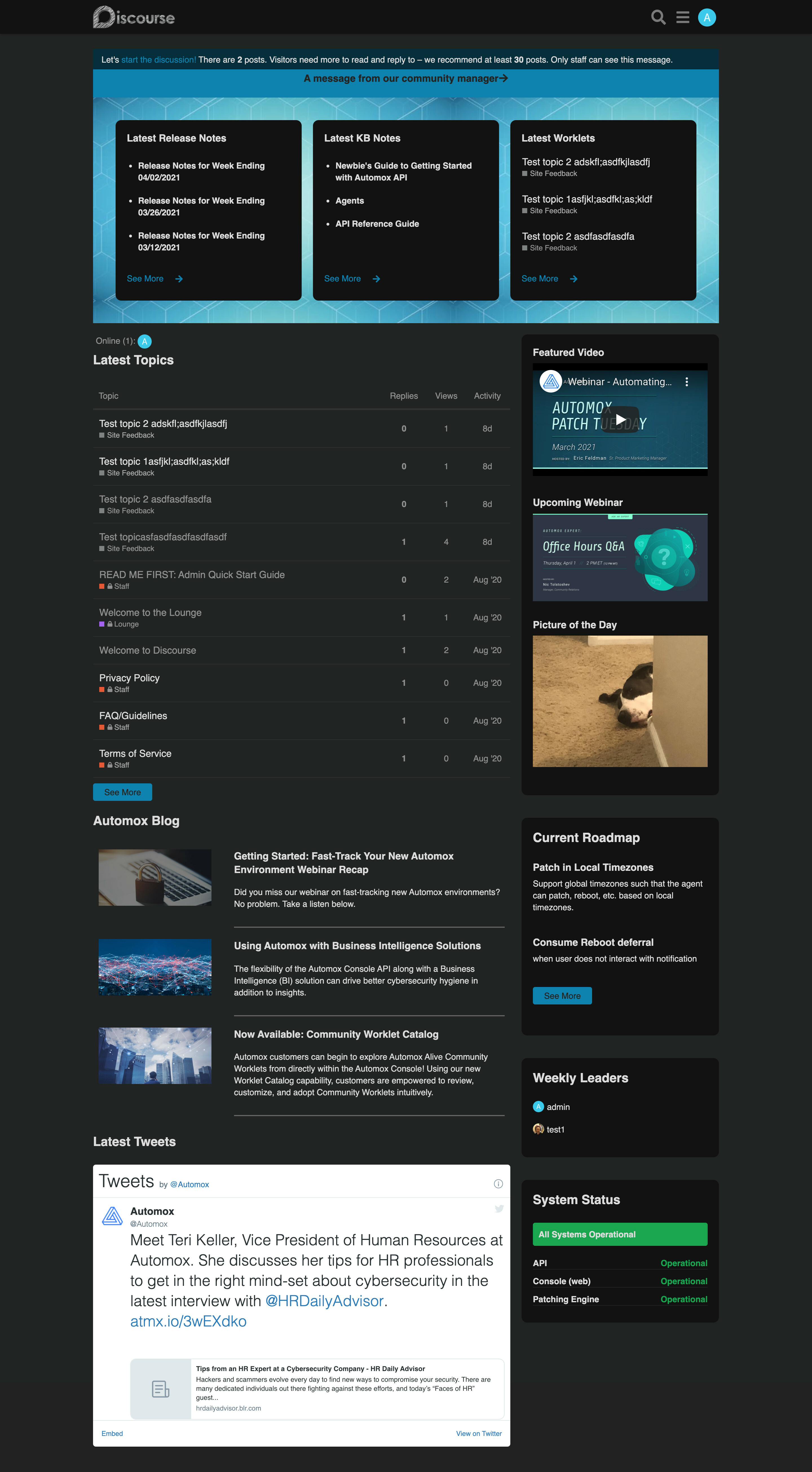
Love it, will the community get a matching colour scheme too?


good question - believe there is a design refresh in progress @Nic and @Brittany?


Yep, we’re almost ready to go with the new community homepage, just a few bugs to work out. Here’s what it will look like when we go live:


I would like to request for the row highlight colour on the system management page to be more noticeable. Sometimes it’s not always obvious which policy you have selected also when you go to run it. It would be handy for it to state which policy it will run e.g RUN POLCY - WINDOWS UPATES


Maybe when you hover ‘Actions’ if the colour changed that would be helpful


I think it would be nice too if on the system management page that policies and worklets could be split in to different tabs or such? For example we have few scripts that run things, combined with policies for updates so if there were maybe a tab for Updates, one for Scripts… If that makes sense


thank you for your feedback, i will be sure to pass along to our designers.